-
Difference-in-DifferencesCausality/3 2025. 3. 22. 12:10
https://mixtape.scunning.com/09-difference_in_differences
1. John Snow's Cholera Hypothesis
When thinking about situations in which a difference-in-differences design can be used, one usually tries to find an instance where a consequential treatment was given to some people or units but denied to others “haphazardly.” This is sometimes called a “natural experiment” because it is based on naturally occurring variation in some treatment variable that affects only some units over time. All good difference-in-differences designs are based on some kind of natural experiment. And one of the most interesting natural experiments was also one of the first difference-in-differences designs. This is the story of how John Snow convinced the world that cholera was transmitted by water, not air, using an ingenious natural experiment (Snow 1855).
Let’s imagine the following thought experiment. If Snow was a dictator with unlimited wealth and power, how could he test his theory that cholera is waterborne? One thing he could do is flip a coin over each household member—heads you drink from the contaminated Thames, tails you drink from some uncontaminated source. Once the assignments had been made, Snow could simply compare cholera mortality between the two groups. If those who drank the clean water were less likely to contract cholera, then this would suggest that cholera was waterborne.
Knowledge that physical randomization could be used to identify causal effects was still eighty-five years away. But there were other issues besides ignorance that kept Snow from physical randomization. Experiments like the one I just described are also impractical, infeasible, and maybe even unethical—which is why social scientists so often rely on natural experiments that mimic important elements of randomized experiments. But what natural experiment was there? Snow needed to find a situation where uncontaminated water had been distributed to a large number of people as if by random chance, and then calculate the difference between those who did and did not drink contaminated water. Furthermore, the contaminated water would need to be allocated to people in ways that were unrelated to the ordinary determinants of cholera mortality, such as hygiene and poverty, implying a degree of balance on covariates between the groups. And then he remembered—a potential natural experiment in London a year earlier had reallocated clean water to citizens of London. Could this work?
In the 1800s, several water companies served different areas of the city. Some neighborhoods were even served by more than one company. They took their water from the Thames, which had been polluted by victims’ evacuations via runoff. But in 1849, the Lambeth water company had moved its intake pipes upstream higher up the Thames, above the main sewage discharge point, thus giving its customers uncontaminated water. They did this to obtain cleaner water, but it had the added benefit of being too high up the Thames to be infected with cholera from the runoff. Snow seized on this opportunity. He realized that it had given him a natural experiment that would allow him to test his hypothesis that cholera was waterborne by comparing the households. If his theory was right, then the Lambeth houses should have lower cholera death rates than some other set of households whose water was infected with runoff—what we might call today the explicit counterfactual. He found his explicit counterfactual in the Southwark and Vauxhall Waterworks Company.
Unlike Lambeth, the Southwark and Vauxhall Waterworks Company had not moved their intake point upstream, and Snow spent an entire book documenting similarities between the two companies’ households. For instance, sometimes their service cut an irregular path through neighborhoods and houses such that the households on either side were very similar; the only difference being they drank different water with different levels of contamination from runoff. Insofar as the kinds of people that each company serviced were observationally equivalent, then perhaps they were similar on the relevant unobservables as well.
Snow meticulously collected data on household enrollment in water supply companies. He matched those data with the city’s data on the cholera death rates at the household level. It was in many ways as advanced as any study we might see today for how he carefully collected, prepared, and linked a variety of data sources to show the relationship between water purity and mortality. But he also displayed scientific ingenuity for how he carefully framed the research question and how long he remained skeptical until the research design’s results convinced him otherwise. After combining everthing, he was able to generate extremely persuasive evidence that influenced policymakers in the city.
(John Snow had a stubborn commitment to the truth and was unpersuaded by low-quality causal evidence. That simultaneous skepticism and open-mindedness gave him the willingness to question common sense when common sense failed to provide satisfactory explanations.)
Snow’s main evidence was striking.

In 1849, there were 135 cases of cholera per 10,000 households at Southwark and Vauxhall and 85 for Lambeth. But in 1854, there were 147 per 10,000 in Southwark and Vauxhall, whereas Lambeth’s cholera cases per 10,000 households fell to 19.
While Snow did not explicitly calculate the difference-in-differences, the ability to do so was there (Coleman 2019). If we difference Lambeth’s 1854 value from its 1849 value, followed by the same after and before differencing for Southwark and Vauxhall, we can calculate an estimate of the ATT equaling 78 fewer deaths per 10,000. While Snow would go on to produce evidence showing cholera deaths were concentrated around a pump on Broad Street contaminated with cholera, he allegedly considered the simple difference-in-differences the more convincing test of his hypothesis.
The importance of the work Snow undertook to understand the causes of cholera in London cannot be overstated. It not only lifted our ability to estimate causal effects with observational data, it advanced science and ultimately saved lives. Of Snow’s work on the cause of cholera transmission, Freedman (1991) states:
The force of Snow’s argument results from the clarity of the prior reasoning, the bringing together of many different lines of evidence, and the amount of shoe leather Snow was willing to use to get the data. Snow did some brilliant detective work on nonexperimental data. What is impressive is not the statistical technique but the handling of the scientific issues. He made steady progress from shrewd observation through case studies to analyze ecological data. In the end, he found and analyzed a natural experiment. (p.298)
2. Estimation
2.1. A simple table
Assume that the intervention is clean water, which I’ll write as D, and our objective is to estimate D’s causal effect on cholera deaths. Let cholera deaths be represented by the variable Y. Can we identify the causal effect of D if we just compare the post-treatment 1854 Lambeth cholera death values to that of the 1854 Southwark and Vauxhall values? This is in many ways an obvious choice, and in fact, it is one of the more common naive approaches to causal inference. After all, we have a control group, don’t we? Why can’t we just compare a treatment group to a control group?
The simple difference in outcomes only collapsed to the ATE if the treatment had been randomized. But it is never randomized in the real world where most choices made by real people is endogenous to potential outcomes.
Let’s represent now the differences between Lambeth and Southwark and Vauxhall with fixed level differences, or fixed effects, represented by L and SV. Both are unobserved, unique to each company, and fixed over time. What these fixed effects mean is that even if Lambeth hadn’t changed its water source there, would still be something determining cholera deaths, which is just the time-invariant unique differences between the two companies as it relates to cholera deaths in 1854.
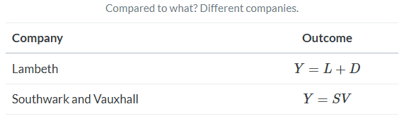
When we make a simple comparison between Lambeth and Southwark and Vauxhall, we get an estimated causal effect equalling D+(L−SV). Notice the second term, L−SV. We’ve seen this before. It’s the selection bias we found from the decomposition of the simple difference in outcomes.
Okay, so say we realize that we cannot simply make cross-sectional comparisons between two units because of selection bias. Surely, though, we can compare a unit to itself? This is sometimes called an interrupted time series. Let’s consider that simple before-and-after difference for Lambeth now.
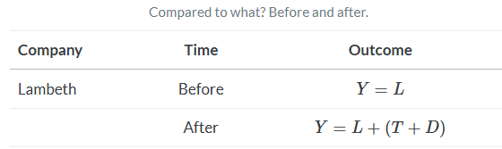
While this procedure successfully eliminates the Lambeth fixed effect (unlike the cross-sectional difference), it doesn’t give me an unbiased estimate of D because differences can’t eliminate the natural changes in the cholera deaths over time. Recall, these events were oscillating in waves. I can’t compare Lambeth before and after (T+D) because of T, which is an omitted variable.
The intuition of the DD strategy is remarkably simple: combine these two simpler approaches so the selection bias and the effect of time are, in turns, eliminated. Let’s look at it in the following table.
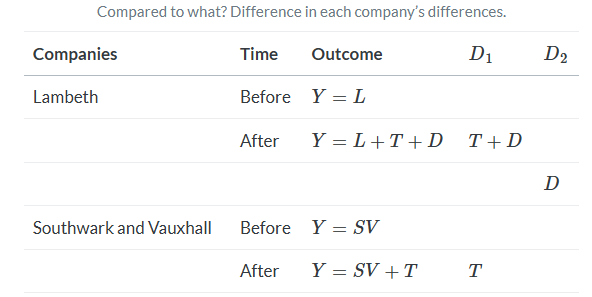
The first difference, D1, does the simple before-and-after difference. This ultimately eliminates the unit-specific fixed effects. Then, once those differences are made, we difference the differences (hence the name) to get the unbiased estimate of D.
But there’s a a key assumption with a DD design, and that assumption is discernible even in this table. We are assuming that there is no time-variant company specific unobservables. Nothing unobserved in Lambeth households that is changing between these two periods that also determines cholera deaths. This is equivalent to assuming that T is the same for all units. And we call this the parallel trends assumption. If you can buy off on the parallel trends assumption, then DD will identify the causal effect.
DD is a powerful, yet amazingly simple design. Using repeated observations on a treatment and control unit (usually several units), we can eliminate the unobserved heterogeneity to provide a credible estimate of the average treatment effect on the treated (ATT) by transforming the data in very specific ways. But when and why does this process yield the correct answer? Turns out, there is more to it than meets the eye. And it is imperative on the front end that you understand what’s under the hood so that you can avoid conceptual errors about this design.
2.2. The simple 2x2 DD
The cholera case is a particular kind of DD design that Goodman-Bacon (2019) calls the 2×2 DD design. The 2×2 DD design has a treatment group k and untreated group U. There is a pre-period for the treatment group, pre(k); a post-period for the treatment group, post(k); a pre-treatment period for the untreated group, pre(U); and a post-period for the untreated group, post(U) So:
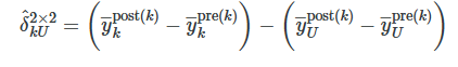
where δ^kU is the estimated ATT for group k, and y― is the sample mean for that particular group in a particular time period. The first paragraph differences the treatment group, k, after minus before, the second paragraph differences the untreated group, U, after minus before. And once those quantities are obtained, we difference the second term from the first.
But this is simply the mechanics of calculations. What exactly is this estimated parameter mapping onto? To understand that, we must convert these sample averages into conditional expectations of potential outcomes. But that is easy to do when working with sample averages, as we will see here. First let’s rewrite this as a conditional expectation.

Now let’s use the switching equation, which transforms historical quantities of Y into potential outcomes. As we’ve done before, we’ll do a little trick where we add zero to the right-hand side so that we can use those terms to help illustrate something important.
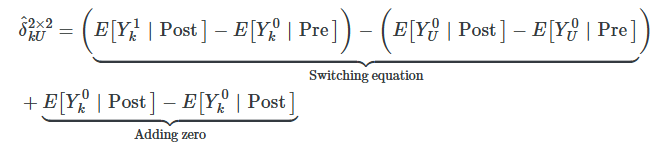
Now we simply rearrange these terms to get the decomposition of the 2×2 DD in terms of conditional expected potential outcomes.
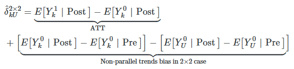
This simple 2×2 difference-in-differences will isolate the ATT (the first term) if and only if the second term zeroes out. It would equal zero if the first difference involving the treatment group, k, equaled the second difference involving the untreated group, U.
The object of interest is Y0, which is some outcome in a world without the treatment. But it’s the post period, and in the post period, Y=Y1 not Y0 by the switching equation. Thus, the first term is counterfactual. And counterfactuals are not observable. This bottom line is often called the parallel trends assumption and it is by definition untestable since we cannot observe this counterfactual conditional expectation.
2.3. DD and the Minimum Wage
Suppose you are interested in the effect of minimum wages on employment. Theoretically, you might expect that in competitive labor markets, an increase in the minimum wage would move us up a downward-sloping demand curve, causing employment to fall. But in labor markets characterized by monopsony, minimum wages can increase employment. Therefore, there are strong theoretical reasons to believe that the effect of the minimum wage on employment is ultimately an empirical question depending on many local contextual factors. This is where Card and Krueger (1994) entered. Could they uncover whether minimum wages were ultimately harmful or helpful in some local economy?
If you could run a randomized experiment, how would you test whether minimum wages increased or decreased employment? You might go across the hundreds of local labor markets in the United States and flip a coin—heads, you raise the minimum wage; tails, you keep it at the status quo. As we’ve done before, these kinds of thought experiments are useful for clarifying both the research design and the causal question.
Lacking a randomized experiment, Card and Krueger (1994) decided on a next-best solution by comparing two neighboring states before and after a minimum-wage increase. It was essentially the same strategy that Snow used in his cholera study and a strategy that economists continue to use, in one form or another, to this day (Dube, Lester, and Reich 2010).
New Jersey was set to experience an increase in the state minimum wage from $4.25 to $5.05 in November 1992, but neighboring Pennsylvania’s minimum wage was staying at $4.25. Realizing they had an opportunity to evaluate the effect of the minimum-wage increase by comparing the two states before and after, they fielded a survey of about four hundred fast-food restaurants in both states—once in February 1992 (before) and again in November (after). The responses from this survey were then used to measure the outcomes they cared about (i.e., employment).
Let’s look at whether the minimum-wage hike in New Jersey in fact raised the minimum wage by examining the distribution of wages in the fast food stores they surveyed. Figure 9.1 shows the distribution of wages in November 1992 after the minimum-wage hike. As can be seen, the minimum-wage hike was binding, evidenced by the mass of wages at the minimum wage in New Jersey.
As a caveat, notice how effective this is at convincing the reader that the minimum wage in New Jersey was binding. This piece of data visualization is not a trivial, or even optional, strategy to be taken in studies such as this. Even John Snow presented carefully designed maps of the distribution of cholera deaths throughout London. Beautiful pictures displaying the “first stage” effect of the intervention on the treatment are crucial in the rhetoric of causal inference, and few have done it as well as Card and Krueger.

Let’s remind ourselves what we’re after—the average causal effect of the minimum-wage hike on employment, or the ATT. Using our decomposition of the 2×2 DD, we can write it out as:
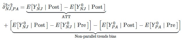
Again, we see the key assumption: the parallel-trends assumption, which is represented by the first difference in the second line. Insofar as parallel trends holds in this situation, then the second term goes to zero, and the 2×2 DD collapses to the ATT.
The 2×2 DD requires differencing employment in NJ and PA, then differencing those first differences. This set of steps estimates the true ATT so long as the parallel-trends bias is zero. When that is true, δ^2×2 is equal to δATT. If this bottom line is not zero, though, then simple 2×2 suffers from unknown bias—could bias it upwards, could bias it downwards, could flip the sign entirely. Table 9.2 shows the results of this exercise from Card and Krueger (1994).
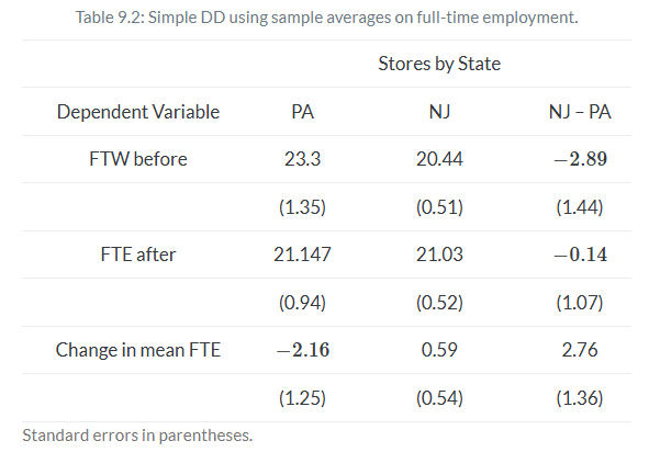
Here you see the result that surprised many people. Card and Krueger (1994) estimate an ATT of +2.76 additional mean full-time-equivalent employment, as opposed to some negative value which would be consistent with competitive input markets.
While differences in sample averages will identify the ATT under the parallel assumption, we may want to use multivariate regression instead. For instance, if you need to avoid omitted variable bias through controlling for endogenous covariates that vary over time, then you may want to use regression. Such strategies are another way of saying that you will need to close some known critical backdoor. Another reason for the equation is that by controlling for more appropriate covariates, you can reduce residual variance and improve the precision of your DD estimate.
Using the switching equation, and assuming a constant state fixed effect and time fixed effect, we can write out a simple regression model estimating the causal effect of the minimum wage on employment, Y. This simple 2×2 is estimated with the following equation:
NJ is a dummy equal to 1 if the observation is from NJ, and D is a dummy equal to 1 if the observation is from November (the post period). This equation takes the following values, which I will list in order according to setting the dummies equal to one and/or zero:
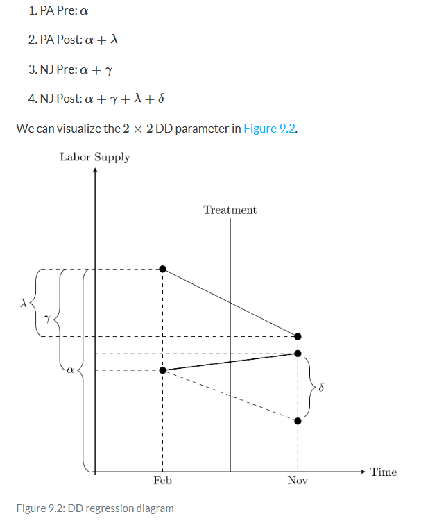
Now before we hammer the parallel trends assumption, I wanted to point something out here which is a bit subtle. The δ parameter is the difference between a counterfactual level of employment and the actual level of employment for New Jersey. It is therefore the ATT, because the ATT is equal to
wherein the first is observed (because Y=Y1 in the post period) and the latter is unobserved for the same reason.
Now here’s the kicker: OLS will always estimate that δ line even if the counterfactual slope had been something else. That’s because OLS uses Pennsylvania’s change over time to project a point starting at New Jersey’s pre-treatment value. When OLS has filled in that missing amount, the parameter estimate is equal to the difference between the observed post-treatment value and that projected value based on the slope of Pennsylvania regardless of whether that Pennsylvania slope was the correct benchmark for measuring New Jersey’s counterfactual slope. OLS always estimates an effect size using the slope of the untreated group as the counterfactual, regardless of whether that slope is in fact the correct one.
But, see what happens when Pennsylvania’s slope is equal to New Jersey’s counterfactual slope? Then that Pennsylvania slope used in regression will mechanically estimate the ATT. In other words, only when the Pennsylvania slope is the counterfactual slope for New Jersey will OLS coincidentally identify that true effect. Let’s see that here in Figure 9.3.
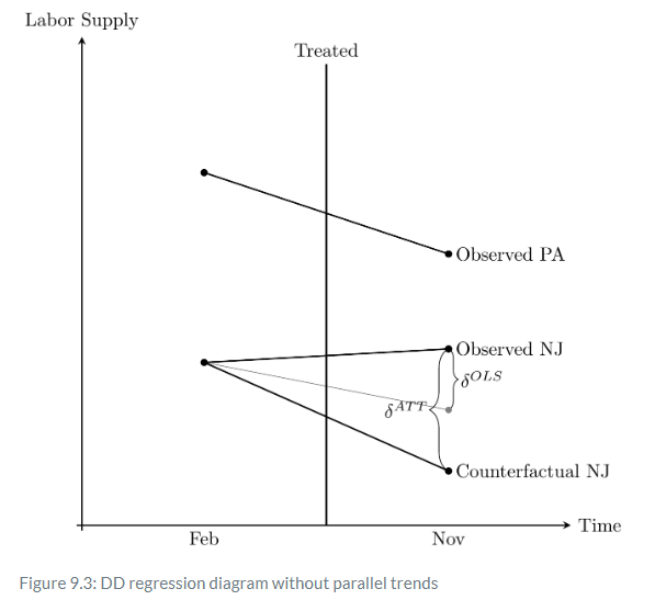
Notice the two δ listed: on the left is the true parameter δATT. On the right is the one estimated by OLS, δ^OLS. The falling solid line is the observed Pennsylvania change, whereas the falling solid line labeled “observed NJ” is the change in observed employment for New Jersey between the two periods.
The true causal effect, δATT, is the line from the “observed NJ” point and the “counterfactual NJ” point. But OLS does not estimate this line. Instead, OLS uses the falling Pennsylvania line to draw a parallel line from the February NJ point, which is shown in thin gray. And OLS simply estimates the vertical line from the observed NJ point to the post NJ point, which as can be seen underestimates the true causaleffect.
Here we see the importance of the parallel trends assumption. The only situation under which the OLS estimate equals the ATT is when the counterfactual NJ just coincidentally lined up with the gray OLS line, which is a line parallel to the slope of the Pennsylvania line. Herein lies the source of understandable skepticism of many who have been paying attention: why should we base estimation on this belief in a coincidence? After all, this is a counterfactual trend, and therefore it is unobserved, given it never occurred. Maybe the counterfactual would’ve been the gray line, but maybe it would’ve been some other unknown line. It could’ve been anything—we just don’t know.
This is why I like to tell people that the parallel trends assumption is actually just a restatement of the strict exogeneity assumption we discussed in the panel chapter. What we are saying when we appeal to parallel trends is that we have found a control group who approximates the traveling path of the treatment group and that the treatment is not endogenous. If it is endogenous, then parallel trends is always violated because in counterfactual the treatment group would’ve diverged anyway, regardless of the treatment.
Before we see the number of tests that economists have devised to provide some reasonable confidence in the belief of the parallel trends, I’d like to quickly talk about standard errors in a DD design.
'Causality > 3' 카테고리의 다른 글
Placebos in DD (0) 2025.03.22 code example (8): weighting on the propensity score (0) 2025.03.20 code example (7): matching - propensity score methods (0) 2025.03.18 code example (6): matching - nearest neighbor covariate (0) 2025.03.18 code example (5): subclassification (0) 2025.03.17